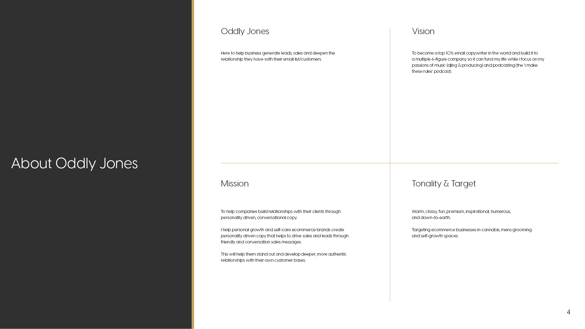
Name of Copywriting Business: “Oddly Jones”
Intention: To help businesses generate leads, sales, and deepen the relationship they have with their email list/customers.
Look and feel of the brand: Still warm, classy, fun, and down-to-earth
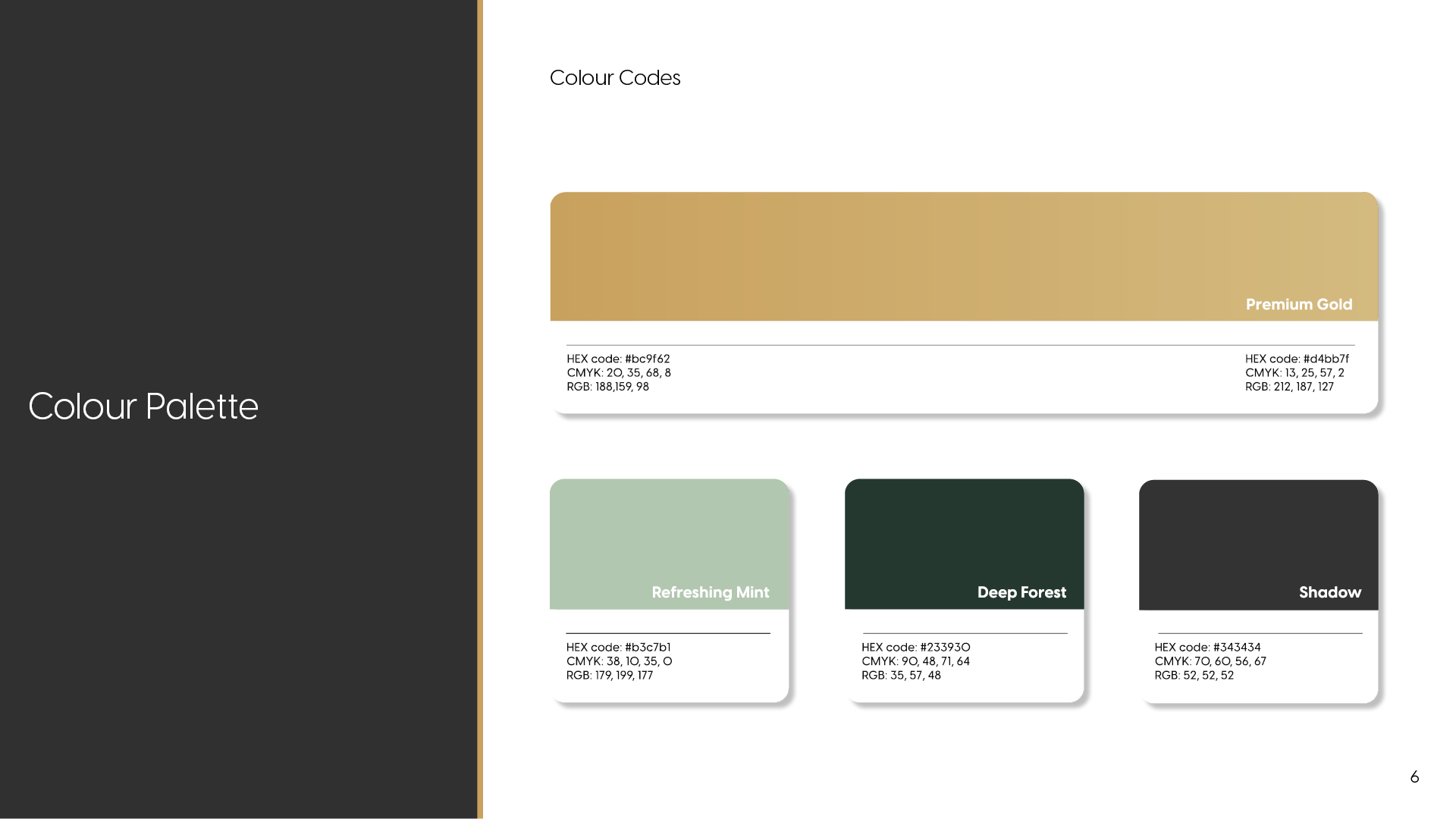
Colour: Earth tone green
Mission: To help companies build relationships with their clients through personality-driven, conversational copy.
Targeting: Ecommerce businesses in cannabis, men’s grooming,and self-growth spaces.
Chosen Stylescape

(Translating strategy into feeling)
Brand Tone & Personality (Integrated)
The personality of Oddly Jones is:
Warm and personable, never distant
Premium and considered, without being elitist
Inspirational, grounded in lived experience
Quietly confident, not performative
This tone guided every decision - ensuring the brand felt authentic, human, and trustworthy, while still positioned at a professional level aligned with serious clients and long-term growth.
How This Informed the Visual Direction
This deeper understanding of Randee’s character directly informed the chosen direction the Stylescape.
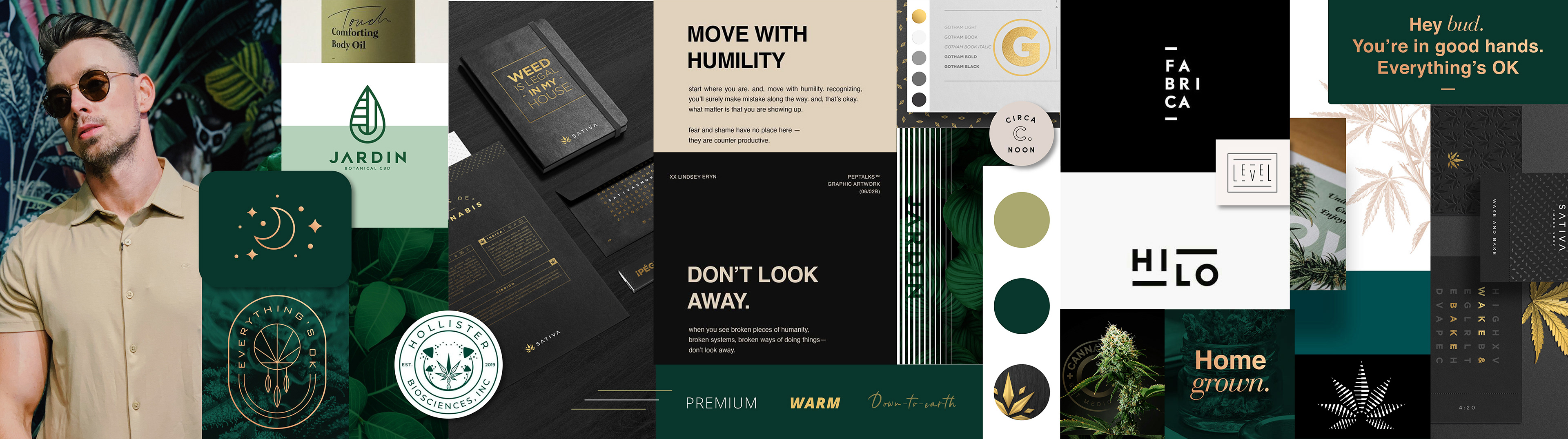
The balance of structure and softness mirrored his writing style - thoughtful, intentional, and quietly expressive. Clean grids and numerical elements brought professionalism and clarity, while handwritten script details echoed the personal, friend-like tone of his copy. Premium materials and refined packaging elevated the brand without stripping it of warmth, ensuring it felt both credible and human.
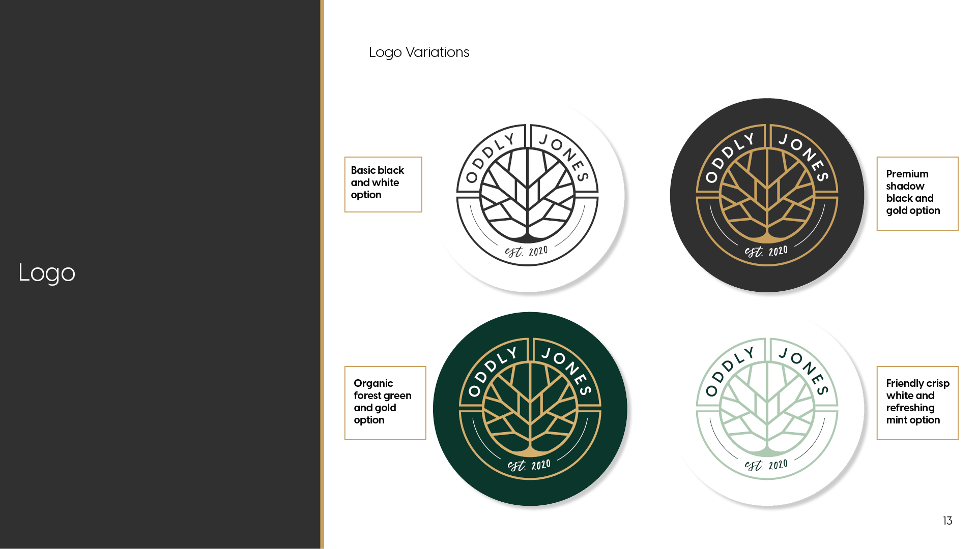
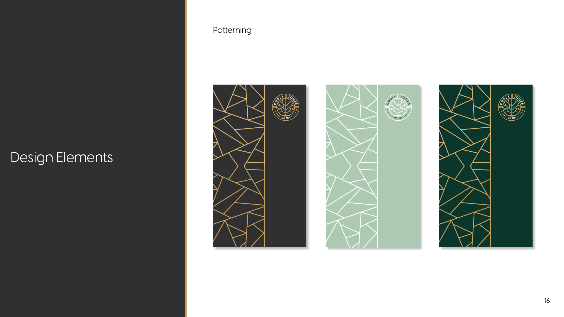
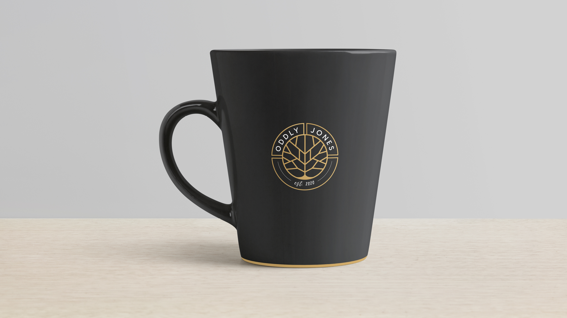
The colour palette - deep forest greens, soft neutrals, and gold accents - reflected grounded growth, prosperity, and trust. Gold became a subtle thread throughout the brand, symbolising value and intention rather than excess, while generous white space allowed the brand to breathe - reinforcing clarity, honesty, and ease.
Brand Context & Founder Narrative
Oddly Jones was created for Randolph Daniel Audley “Oddly” Jones, a Canada-based copywriter from Ontario whose work is defined by warmth, honesty, and human connection. The brand name itself is a quiet play on his middle name, Audley, and his naturally “odd” - thoughtful, personable, and distinctive - writing style.
Randee’s gift lies in his ability to write copy that sounds as though it came from a close friend rather than a sales page. He gravitates toward businesses that are authentic, real, and values-driven - a reflection of his own character. In the uncertainty and intensity of 2020, this brand became an intentional step toward claiming his voice, his craft, and his independence, transforming personal truth into a professional offering.
The brand needed to honour this humanity without becoming casual or unrefined - balancing warmth and approachability with credibility and premium presence.
Intention & Authority
(Understanding before aesthetics)
Before any visual decisions were made, the focus was on uncovering the deeper truth of the brand.
Oddly Jones was created for modern men who value self-awareness, personal growth, and conscious living - men who are grounded, thoughtful, and quietly confident. The brand needed to speak to those who seek quality and meaning, without excess or performance.
The emotional state the brand needed to project was one of calm assurance - safe, steady, and trustworthy, while still feeling warm and human. The challenge extended beyond “needing branding” into creating a sense of belonging and credibility within spaces such as cannabis, self-care, grooming, and personal development - industries often saturated with either aggression or trend-led aesthetics.
This stage established clarity and authority, ensuring the brand spoke from a place of grounded confidence rather than visual noise.
Positioning & Strategy
(Clarity of direction)
With intention defined, the focus moved into strategic positioning.
Audience Insight
The audience values:
Authenticity over hype
Craft, quality, and intention
Brands that feel human, trustworthy, and aligned
They tend to avoid anything overly loud, artificial, or performative, and respond best to brands that feel calm, considered, and quietly premium.
Brand Personality
Oddly Jones was shaped as a person - warm, grounded, intelligent, and reflective. Masculine, yet gentle. Structured, yet welcoming. A brand that feels safe in its own presence, and confident without needing to prove itself.
Strategic Direction
The chosen direction balanced nature and structure, premium restraint and warmth, and growth with groundedness. This path was selected over more trend-driven or overtly lifestyle-led directions because it offered longevity, trust, and emotional resonance - allowing the brand to evolve without losing its core.
This clarity removed ambiguity and created a strong foundation for all visual and experiential decisions.
Founder Alignment (Why the Brand Feels True)
Every element of Oddly Jones was designed to reflect the man behind it - Randee’s gentle masculine energy, his grounded presence, and his ability to hold structure without rigidity. The brand does not shout or persuade aggressively; it invites, reassures, and connects.
This alignment between founder, voice, and visual identity ensures the brand feels natural rather than manufactured - a true extension of the person behind it.
Why This Matters
By anchoring the brand in personal truth and translating that into a strategic, visual system, Oddly Jones was positioned to grow sustainably. The brand feels familiar yet refined, personal yet professional - allowing Randee to show up fully as himself while offering clients clarity, trust, and connection.
This is branding not as performance, but as embodiment.
Every brand I build follows a considered journey - beginning with understanding, moving through expression, and ending in meaningful impact.
This approach ensures the brand is not only visually refined, but deeply aligned, intentional, and built to last.
For Oddly Jones, this meant creating a brand that felt grounded, premium, and human - balancing structure with warmth, and authority with approachability.
Visual Identity
(Expression with meaning)
Once direction was clear, the visual identity was designed with intention.
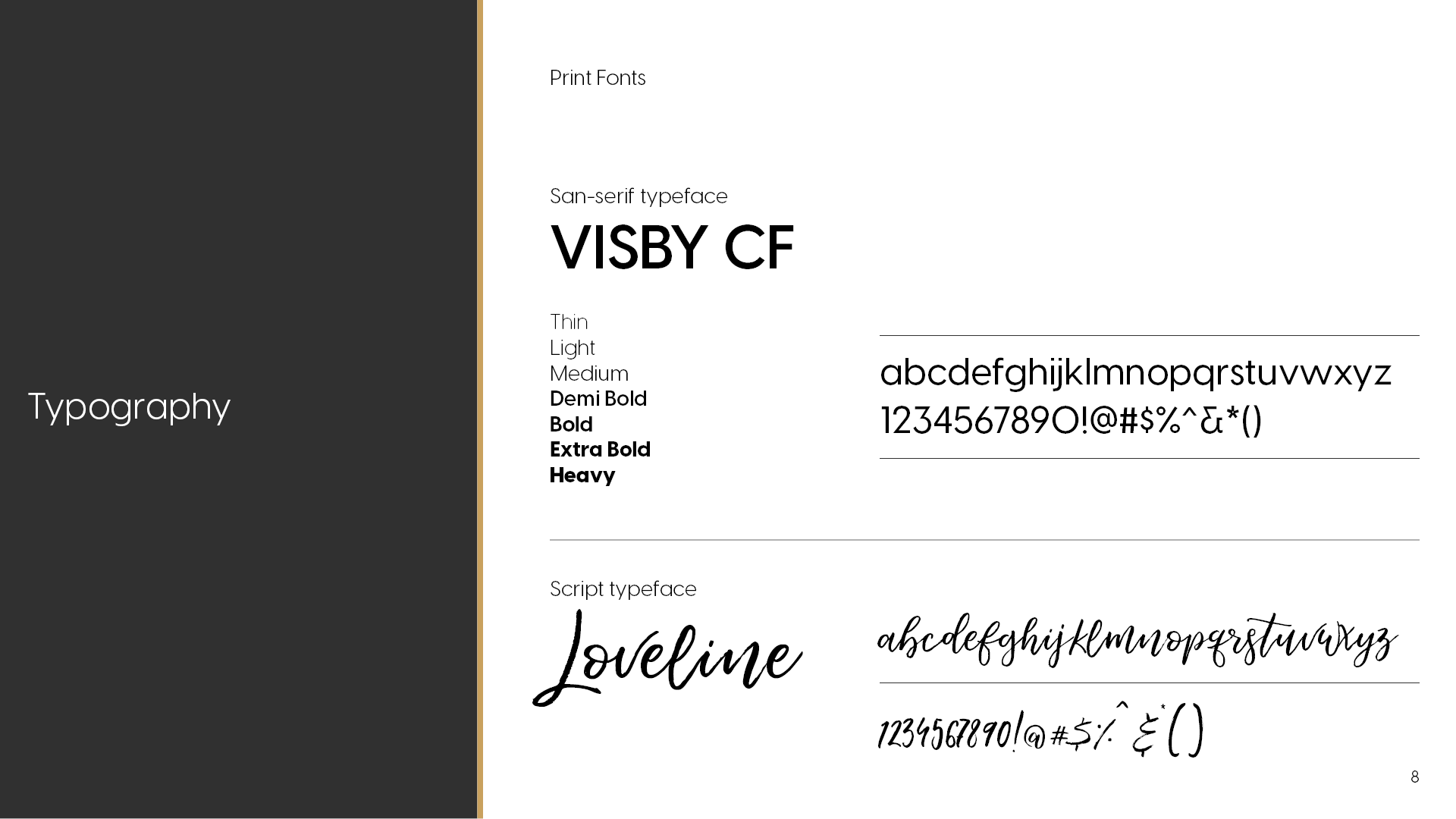
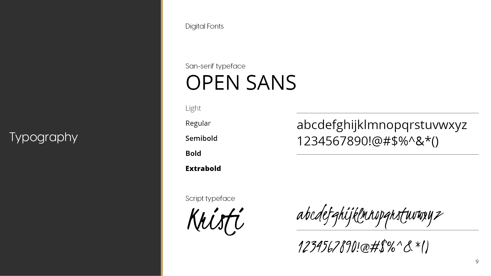
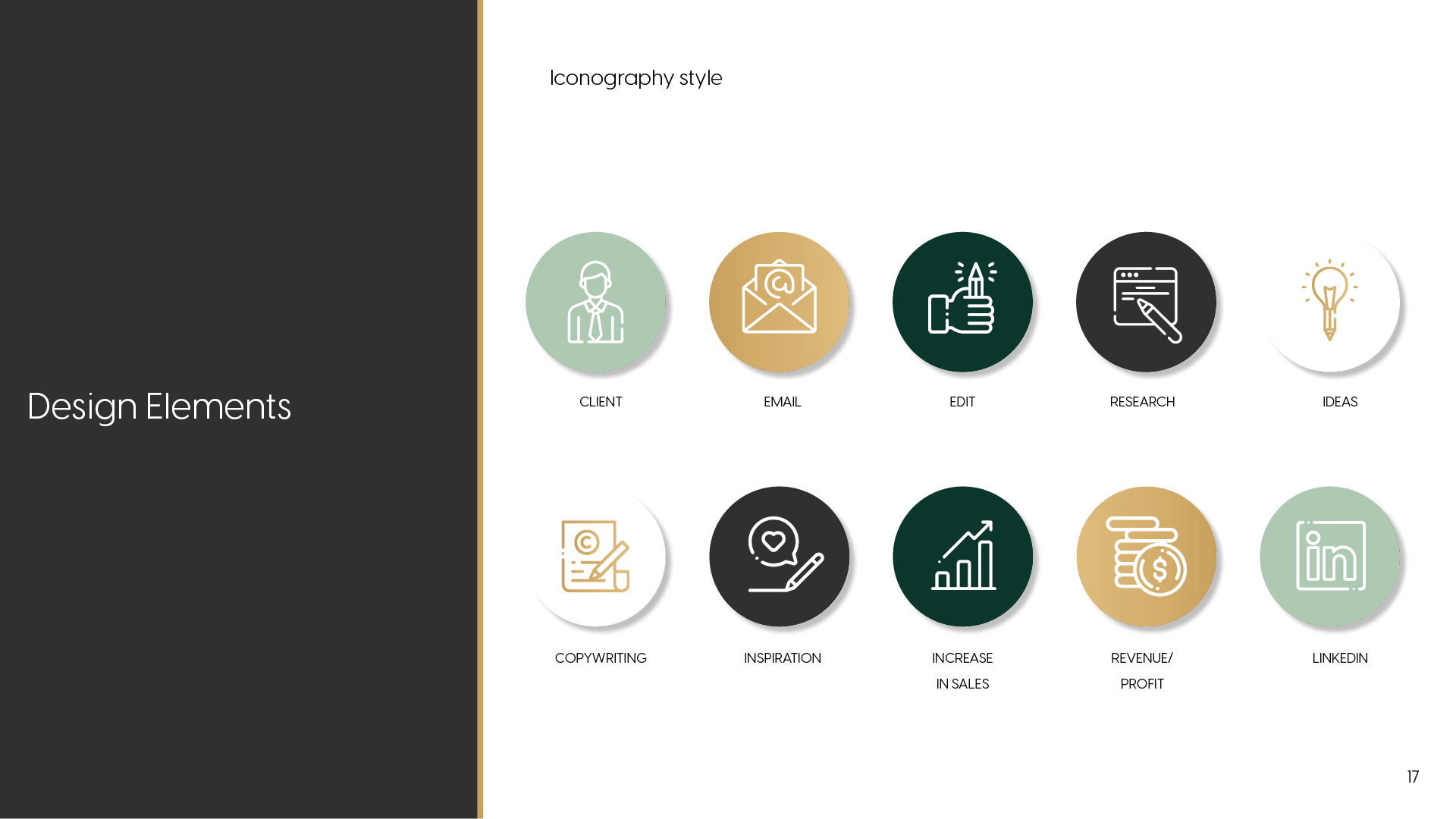
Colour choices were rooted in psychology and emotion - deep greens for grounding and growth, gold for value and prosperity, and neutral shadows for stability and calm. Typography combined a clean, modern sans-serif with a handwritten script, balancing clarity and structure with warmth and personality.
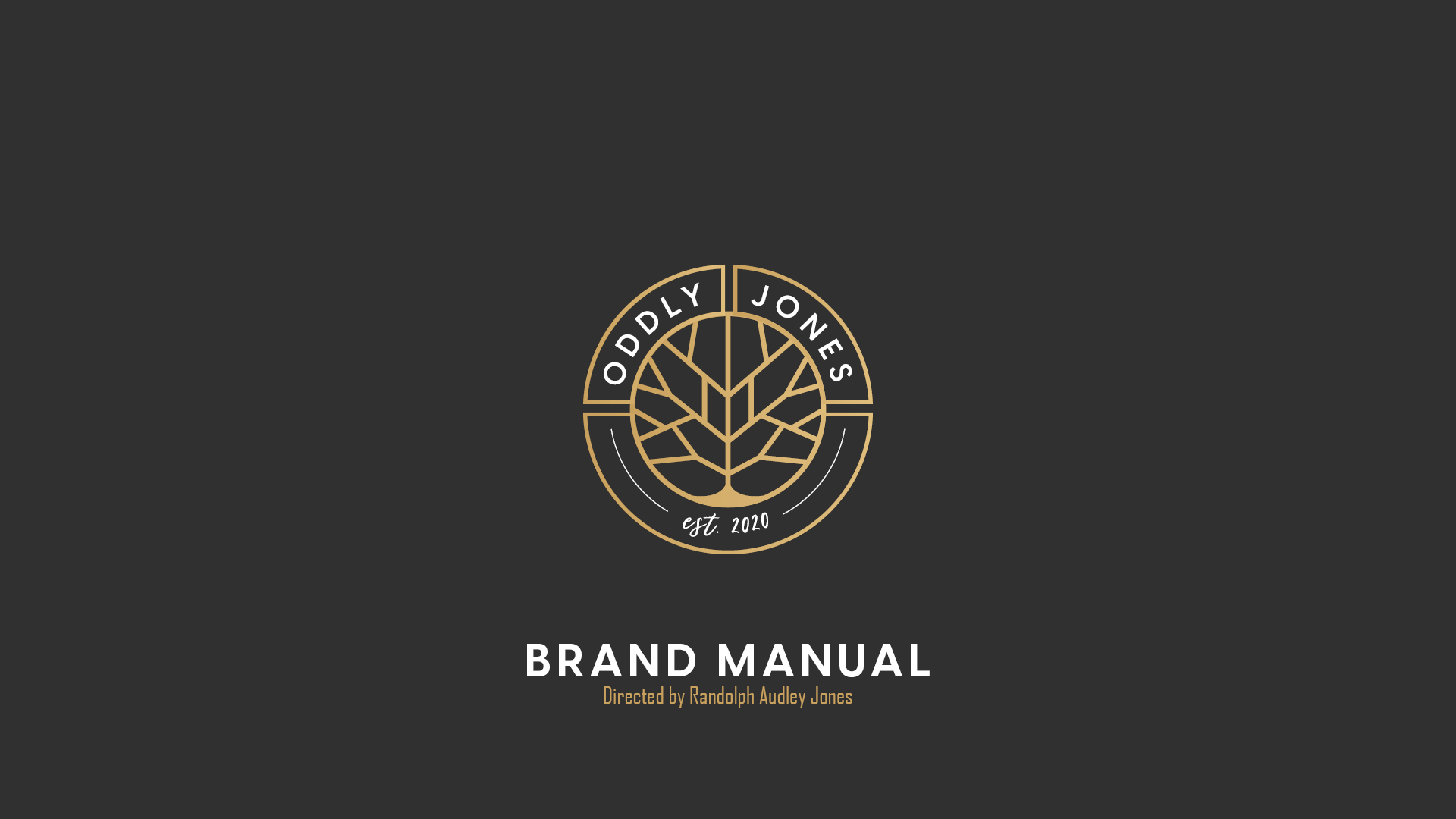
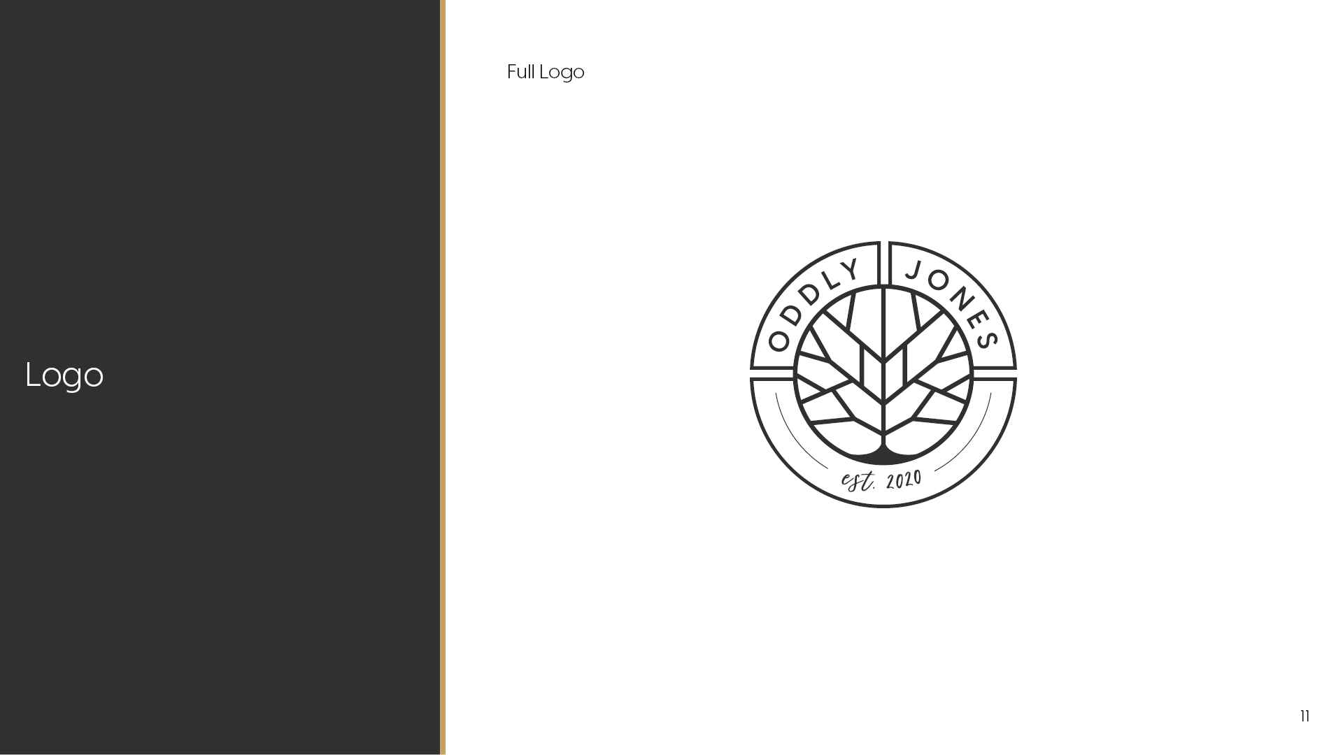
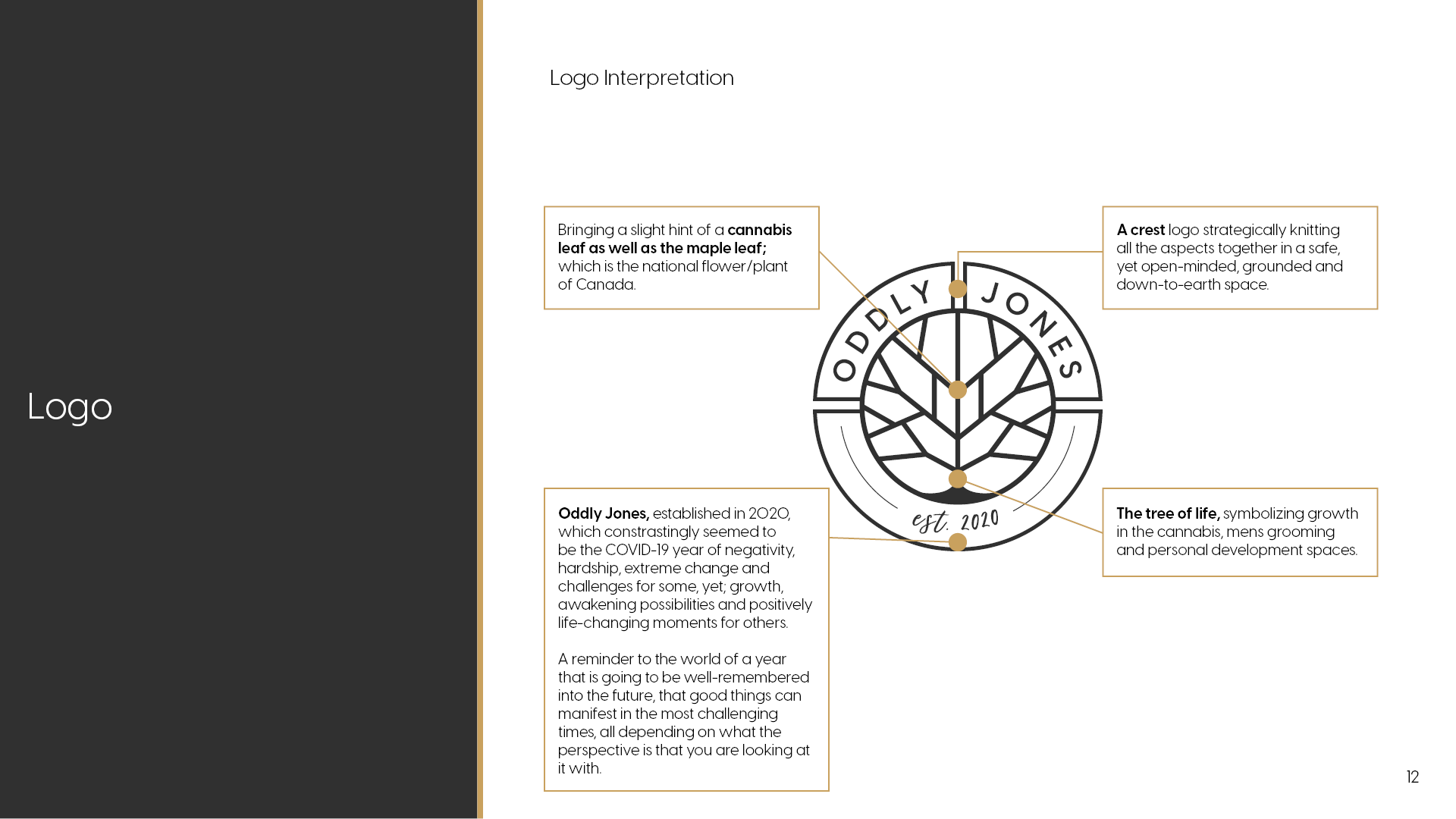
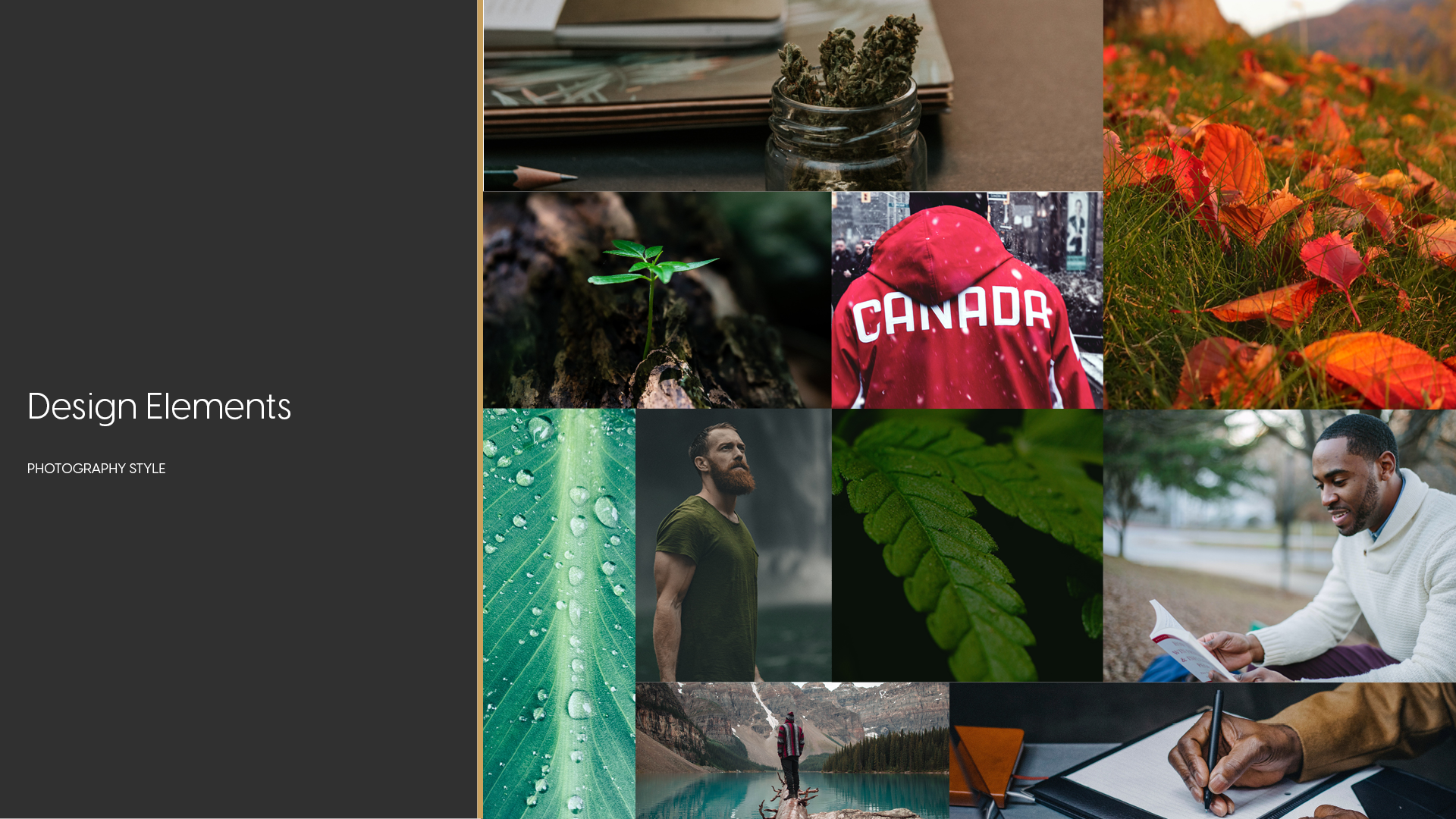
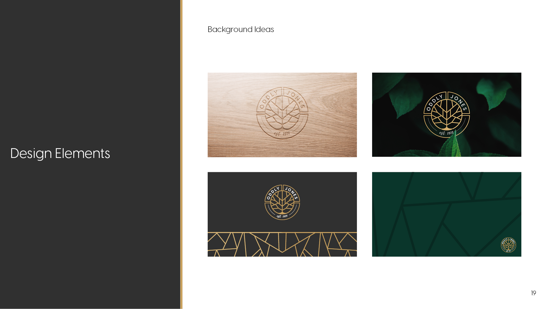
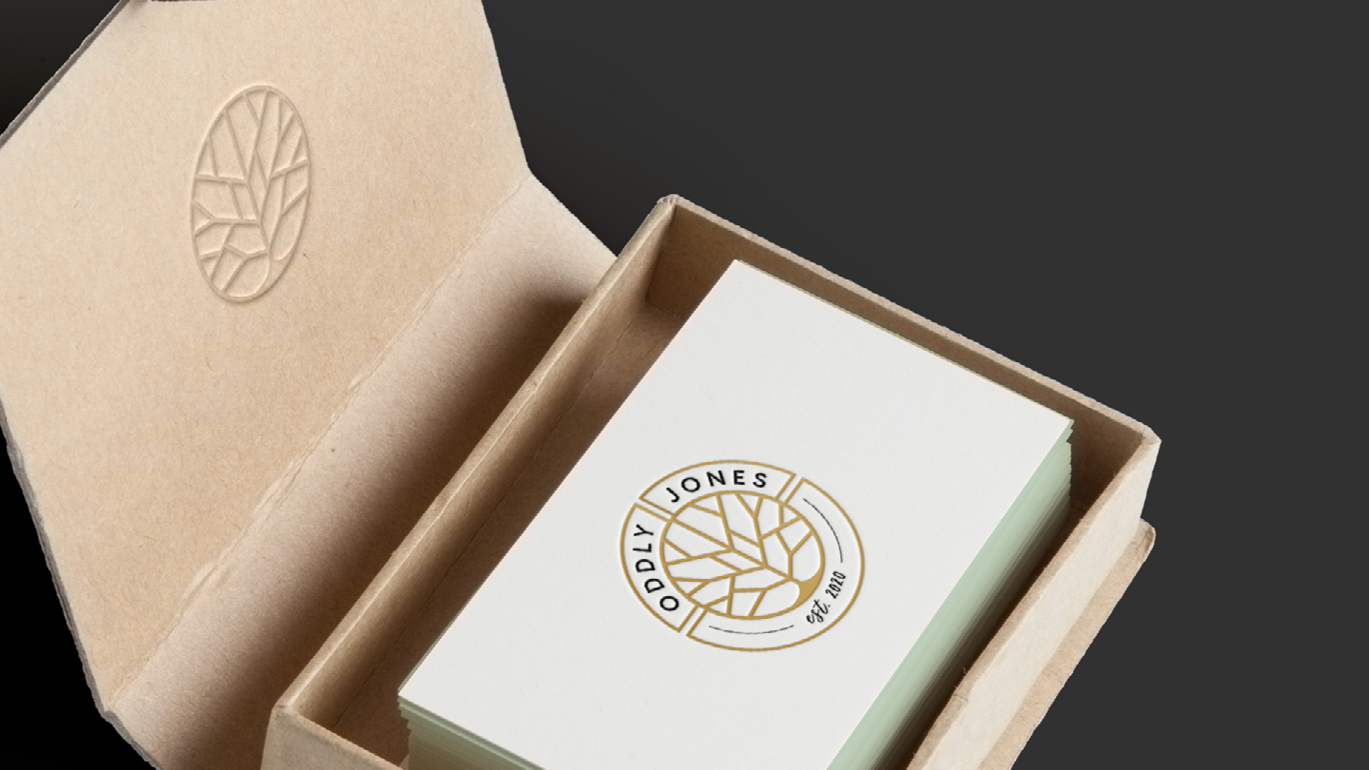
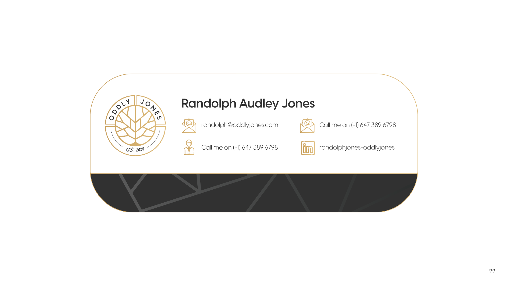
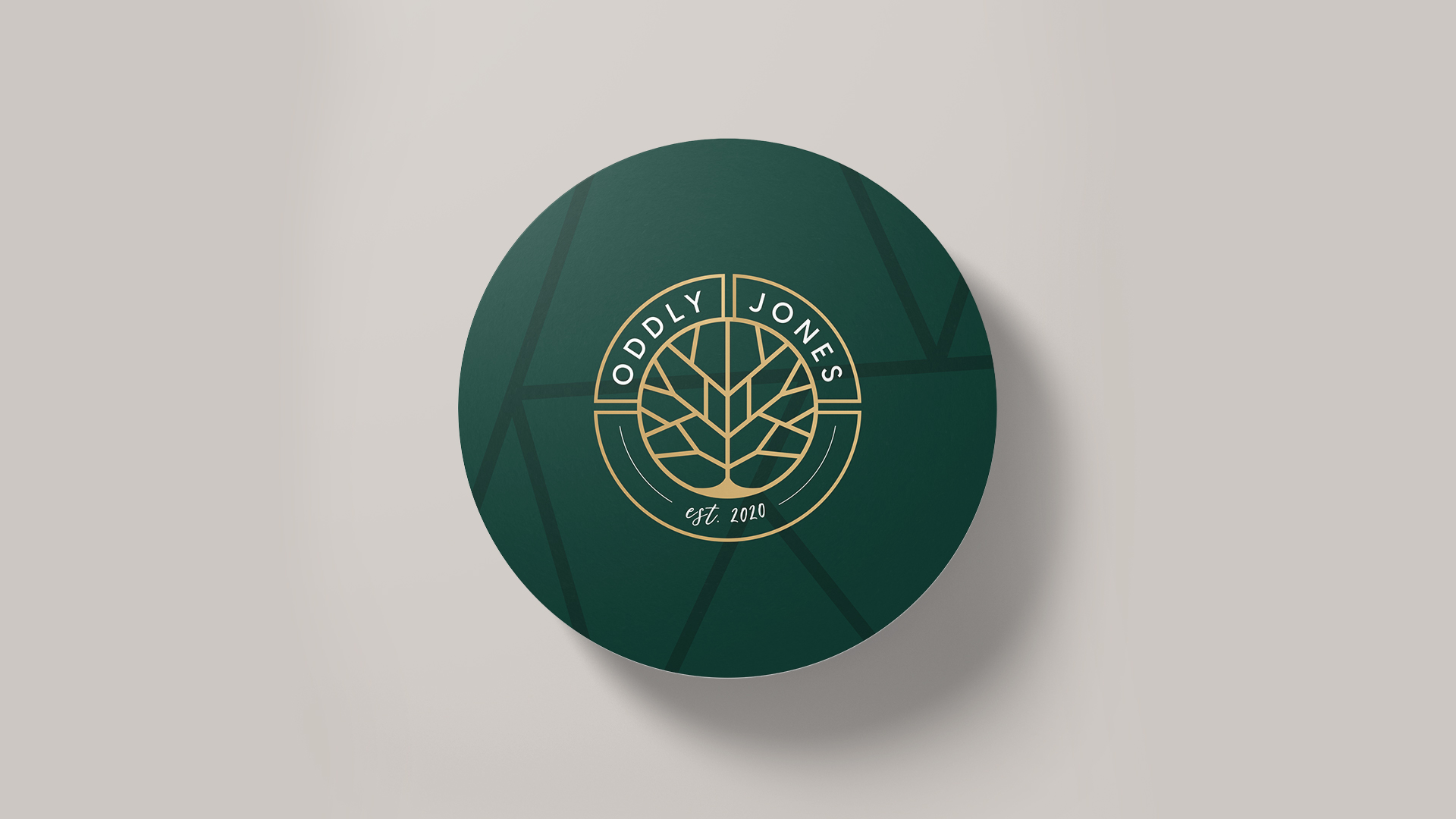
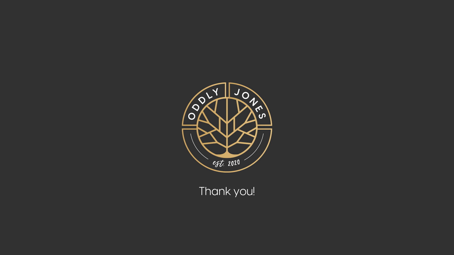
The logo mark brings this balance to life. The circular crest symbolises wholeness, continuity, and trust, while the internal leaf structure subtly references both the cannabis plant and the maple leaf - grounding the brand in nature and its Canadian roots. The central geometry creates a distinctive, memorable form that feels structured yet organic.
Every visual decision supports the brand’s deeper narrative.
System Thinking
(Designing for longevity)
Oddly Jones was designed as a cohesive system, not a single visual moment.
The identity extends seamlessly across:
Print and packaging
Digital platforms
Brand collateral
Social and experiential touchpoints
Every element was considered as part of a whole.
Each touchpoint was designed to feel cohesive, recognisable, and quietly authoritative - reinforcing trust and consistency wherever the brand appears.
Results & Impact
(Alignment in practice)
The final brand positioned Oddly Jones as a calm, premium, and trustworthy presence within the cannabis and self-care space. It shifted perception from trend-driven to intentional, allowing the brand to communicate depth, authenticity, and longevity.
The experience of the brand feels considered and grounding - inviting connection rather than attention, and growth rather than excess.
Reflection
(Why this work matters to me)
This project reflects what I value most in branding - depth, intention, and honesty. Oddly Jones was built through alignment rather than decoration, allowing the brand to feel true to its purpose and audience.
I work best with clients who care about meaning as much as aesthetics, and who are ready to build something enduring.
Created by BlueSkye Studios (Pty) Ltd.
www.blueskyestudios.com