Carepoint Advisory Branding
Website: https://carepointadvisory.co.za
The Brief Beneath the Brief
Carepoint Advisory works with doctors - highly skilled professionals with demanding schedules, complex finances, and little tolerance for noise or inefficiency.
The brief was not simply to “design a logo,” but to create a brand that communicated absolute trust, clarity, and long-term thinking. The identity needed to feel premium and established, without arrogance; intelligent, without being cold; and strategic, without feeling inaccessible.
This brand needed to reassure before it persuaded.
Chosen Stylescape
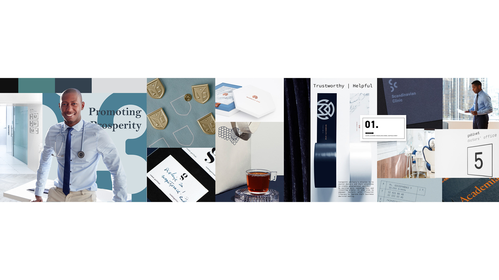
“Peace of Mind”
How it felt:
This direction felt calm, assured, and deeply trustworthy. It balanced authority with restraint - structured without being rigid, premium without being loud.
What it communicated:
Stability
Intelligence
Longevity
Strategic guidance
Generational thinking
Why this was the chosen direction:
This stylescape best embodied the essence of Carepoint Advisory.
It aligned seamlessly with the mindset of doctors - professionals who value precision, discretion, and long-term planning. The visual language felt composed and enduring, reinforcing Carepoint’s role as a steady partner in complex financial decisions.
This direction provided a clear, confident foundation for the brand to be developed across all touchpoints.
Stylescape 3 held the essence of Carepoint Advisory by balancing structure with flow -reflecting both the precision and humanity of its audience. Bold numerical elements and subtle grid systems introduced a sense of order, logic, and counting, while handwritten script details softened the aesthetic, bringing warmth and approachability.
Premium paper choices and considered packaging elevated the experience, creating a tactile sense of trust, clarity, and prosperity. A restrained palette of deep blues, chrome, and gold wove a golden thread throughout the identity, with breathable white space allowing the brand to feel clear, composed, and unhurried.
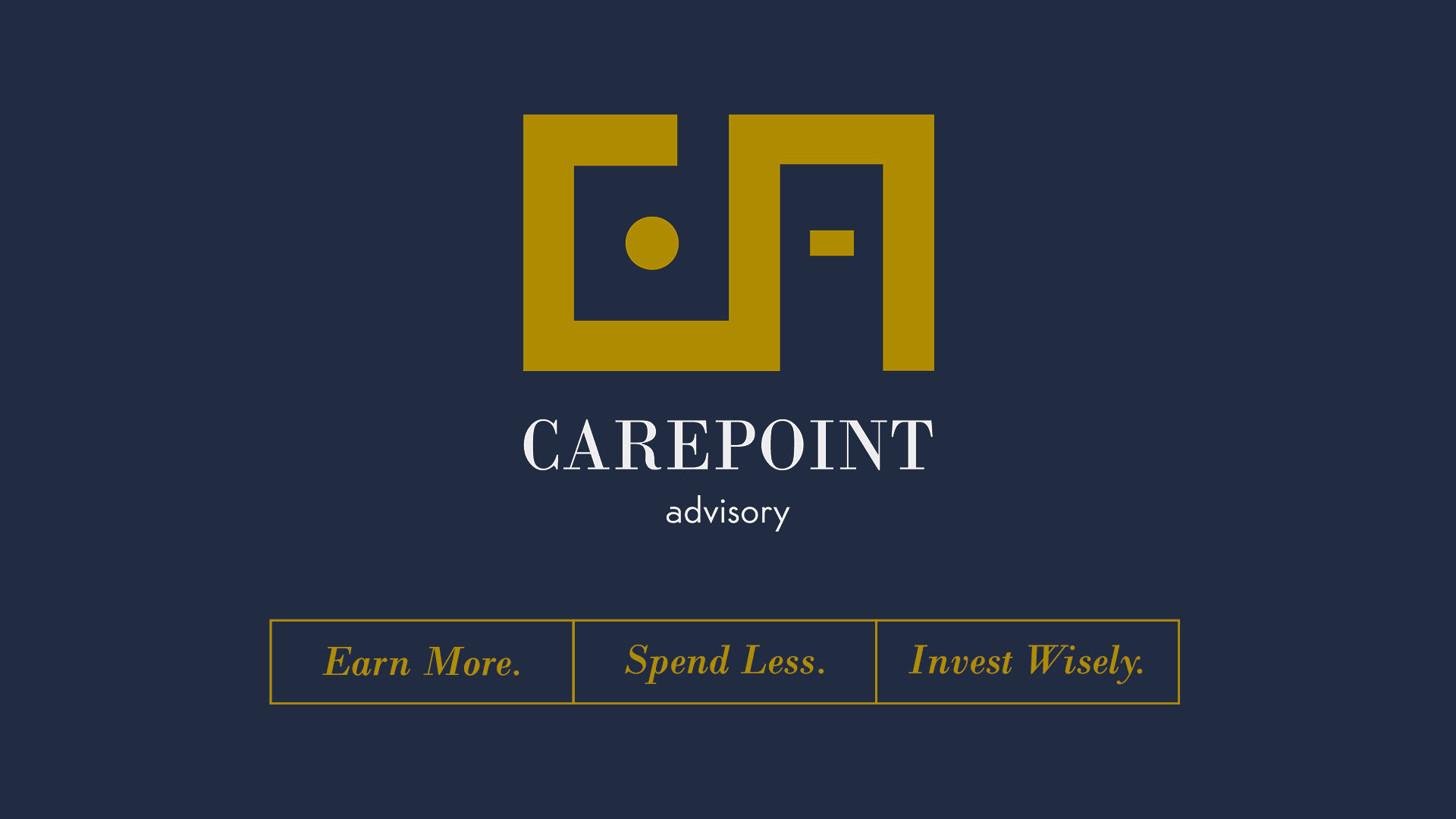
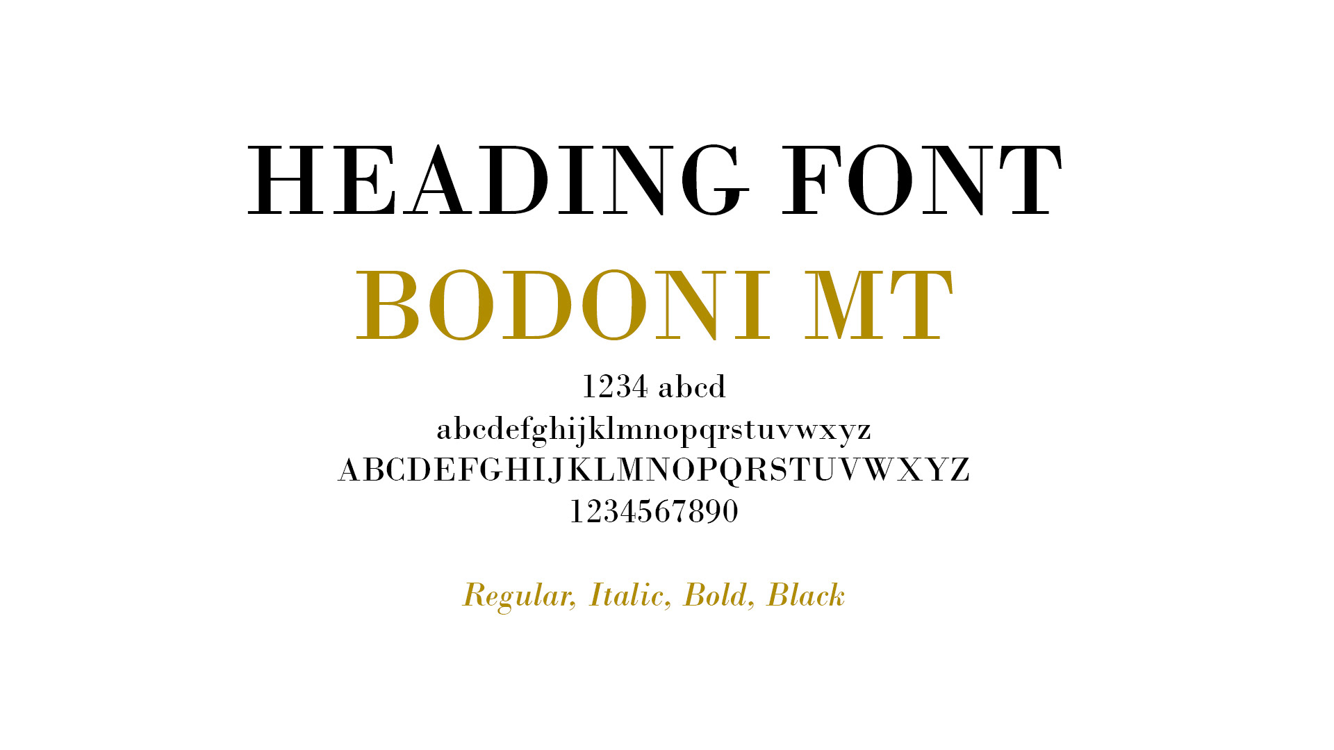
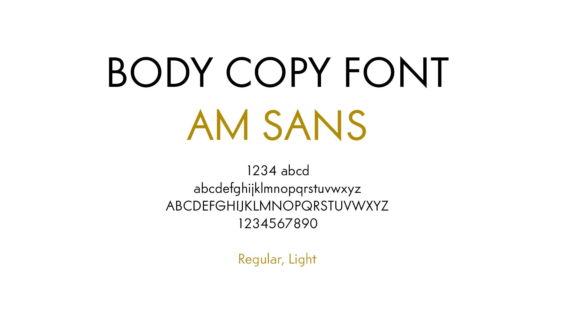
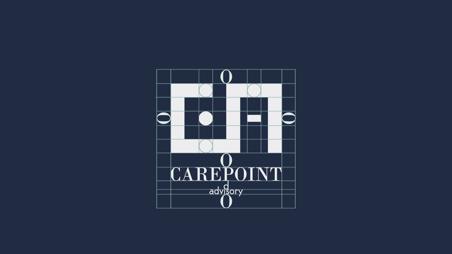
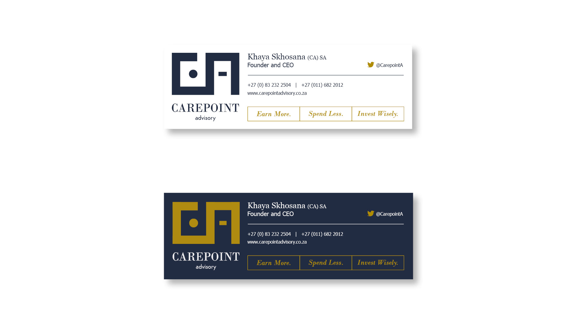
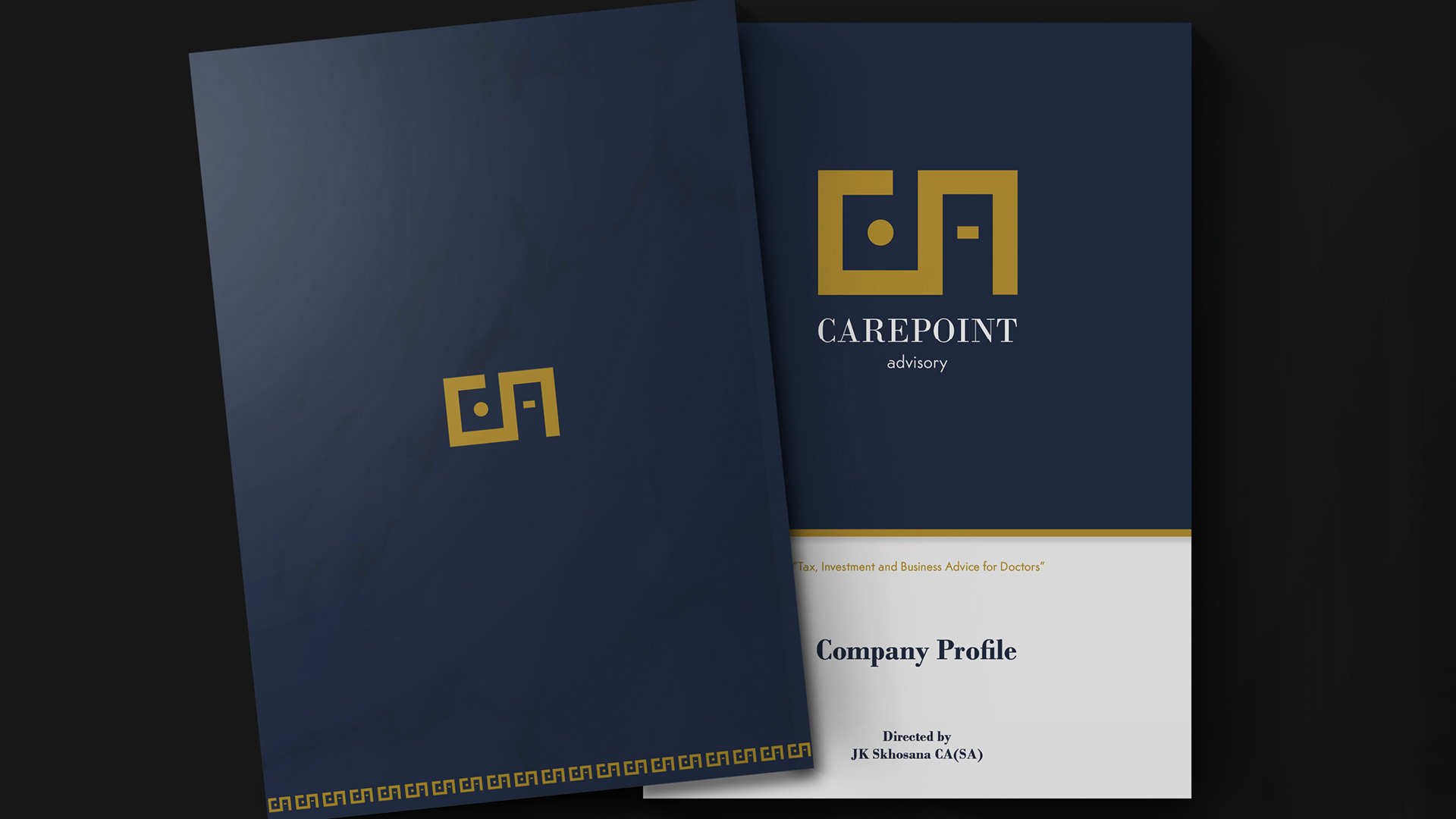
The logo brings this balance to life through the interlinking of the C and A, forming a distinctive circular mark with a central dash - a subtle symbol of connection, guidance, and focus. The typography pairs a timeless serif with a clean, modern sans-serif, reinforcing both credibility and clarity.
Together, these elements reflect the character of the brand’s founder, Khaya Skhosana - his gentle yet grounded masculine presence, his structured thinking, and his welcoming, wise approach - resulting in a mark that feels professional, memorable, and deeply human.
Stylescape 2
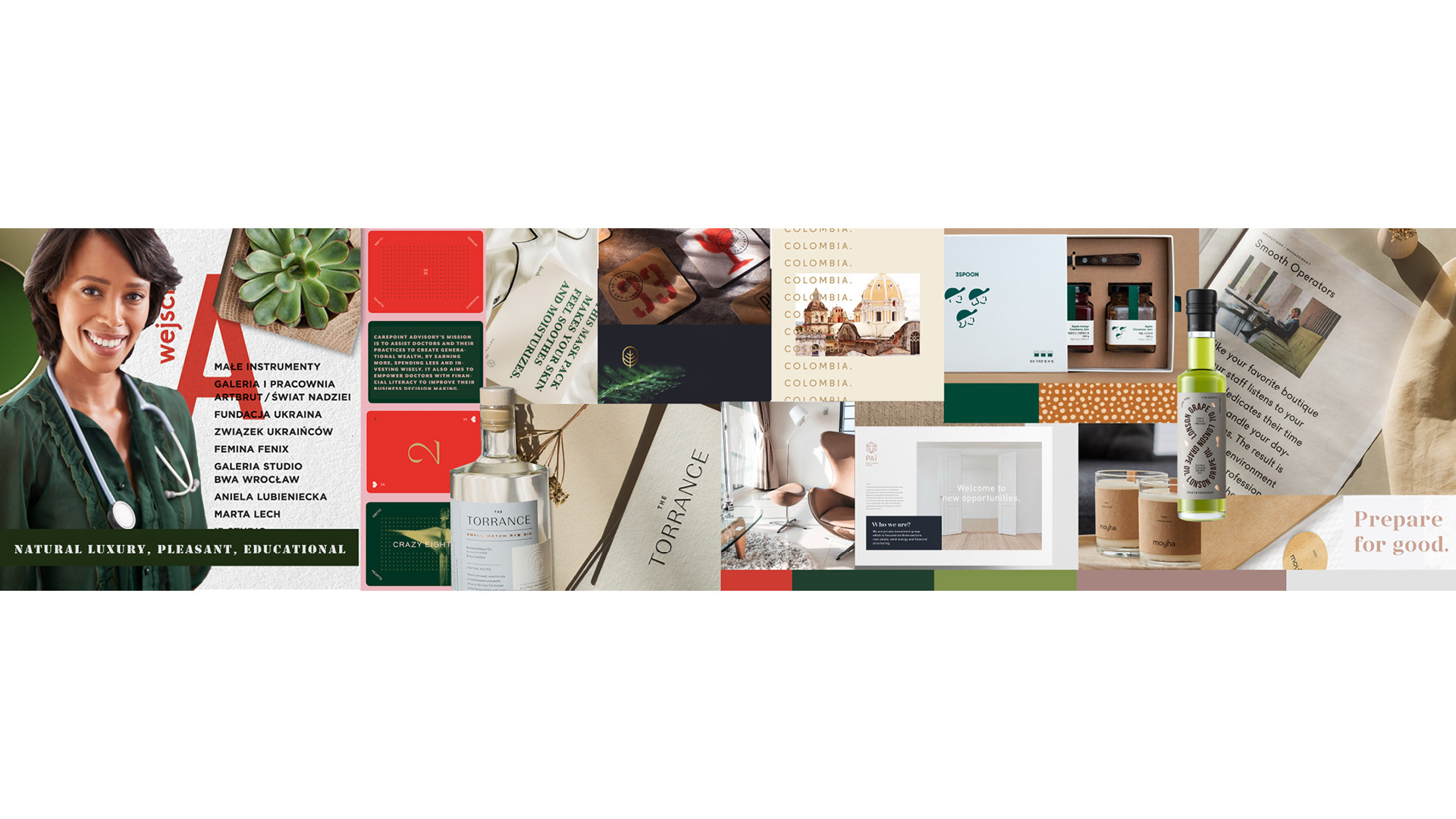
“Contribution to Society”
How it felt:
This direction felt warm, human, and approachable. It leaned into natural textures, soft greens, organic materials, and an educational tone. The feeling was reassuring and personable - professional, yet friendly.
What it communicated:
Trust
Approachability
Care and guidance
Education without intimidation
Why it mattered:
This stylescape explored the human side of the brand - acknowledging that Carepoint works with people under pressure, who value clarity and support.
However, while it felt welcoming, it leaned slightly too soft for the level of authority required in financial and tax advisory.
Stylescape 3
“Enlightened Sophistication”
How it felt:
This direction felt elevated, modern, and aspirational. It introduced darker tones, sharper contrasts, and refined materials - signalling success, exclusivity, and high value.
What it communicated:
Prestige
Success
Professional accomplishment
High standards
Why it mattered:
This stylescape explored how Carepoint could position itself among premium advisory brands. It raised the perceived value significantly, but risked leaning too far into lifestyle and aspiration rather than grounded trust.
It was confident - but not yet anchored.

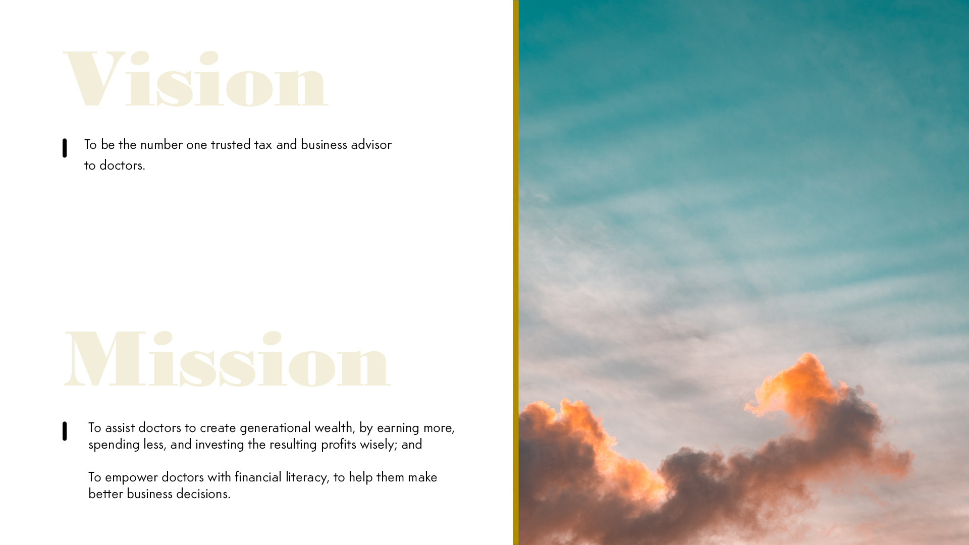
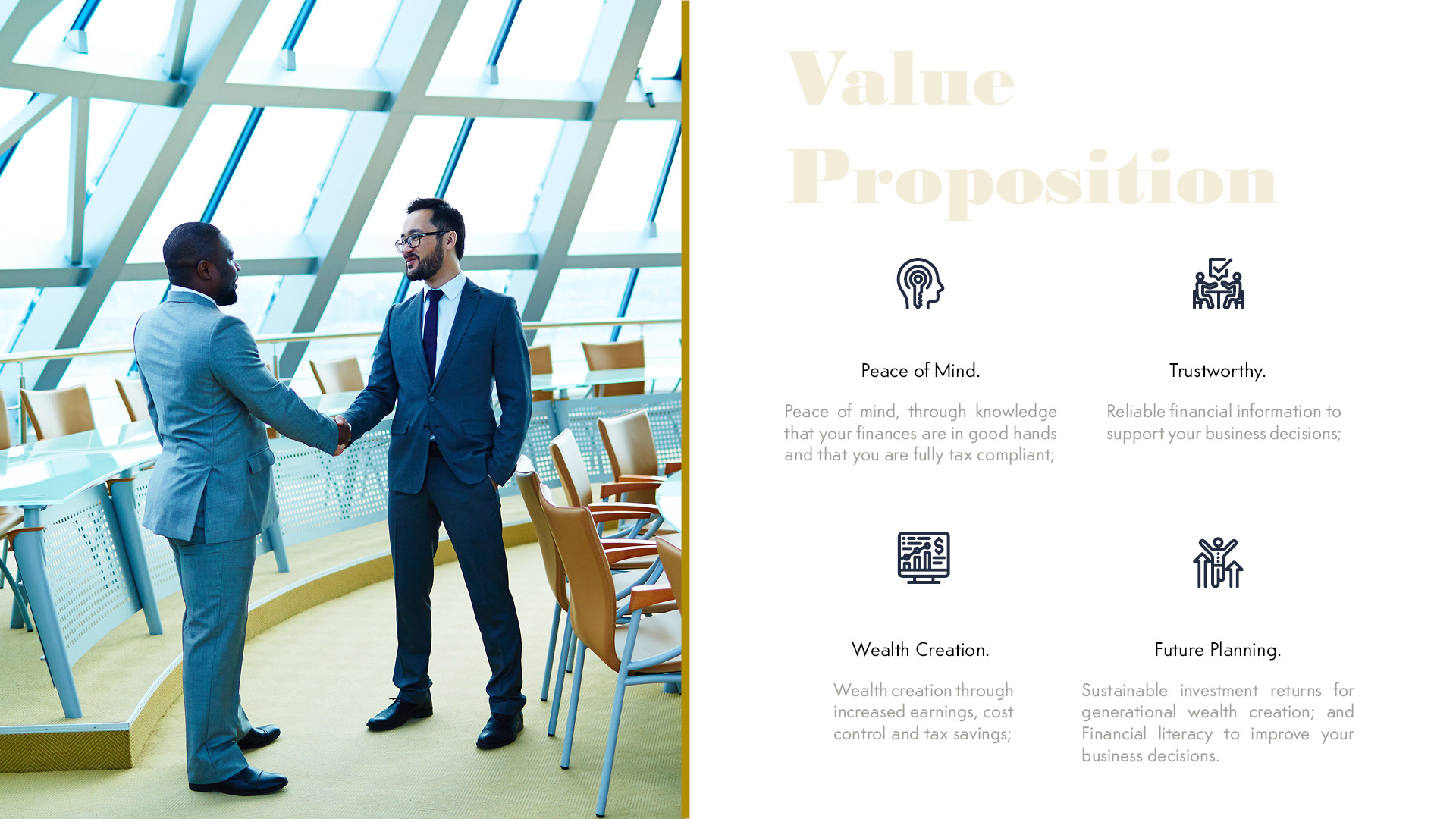
Brand Strategy & Rationale
Audience Insight
Carepoint’s audience values precision, discretion, and credibility. As high earners responsible for both their practices and their personal wealth, doctors seek advisors who feel steady, knowledgeable, and dependable - not sales-driven or trend-focused.
They respond to brands that signal competence quietly.


Strategic Direction
We intentionally avoided visual tropes common in financial services - such as overt symbols of growth, wealth, or aggression - and instead focused on a timeless, structured visual language. The goal was longevity: a brand that would feel as relevant and credible in ten years as it does today.

Visual Language
The visual identity is anchored in restraint and precision.
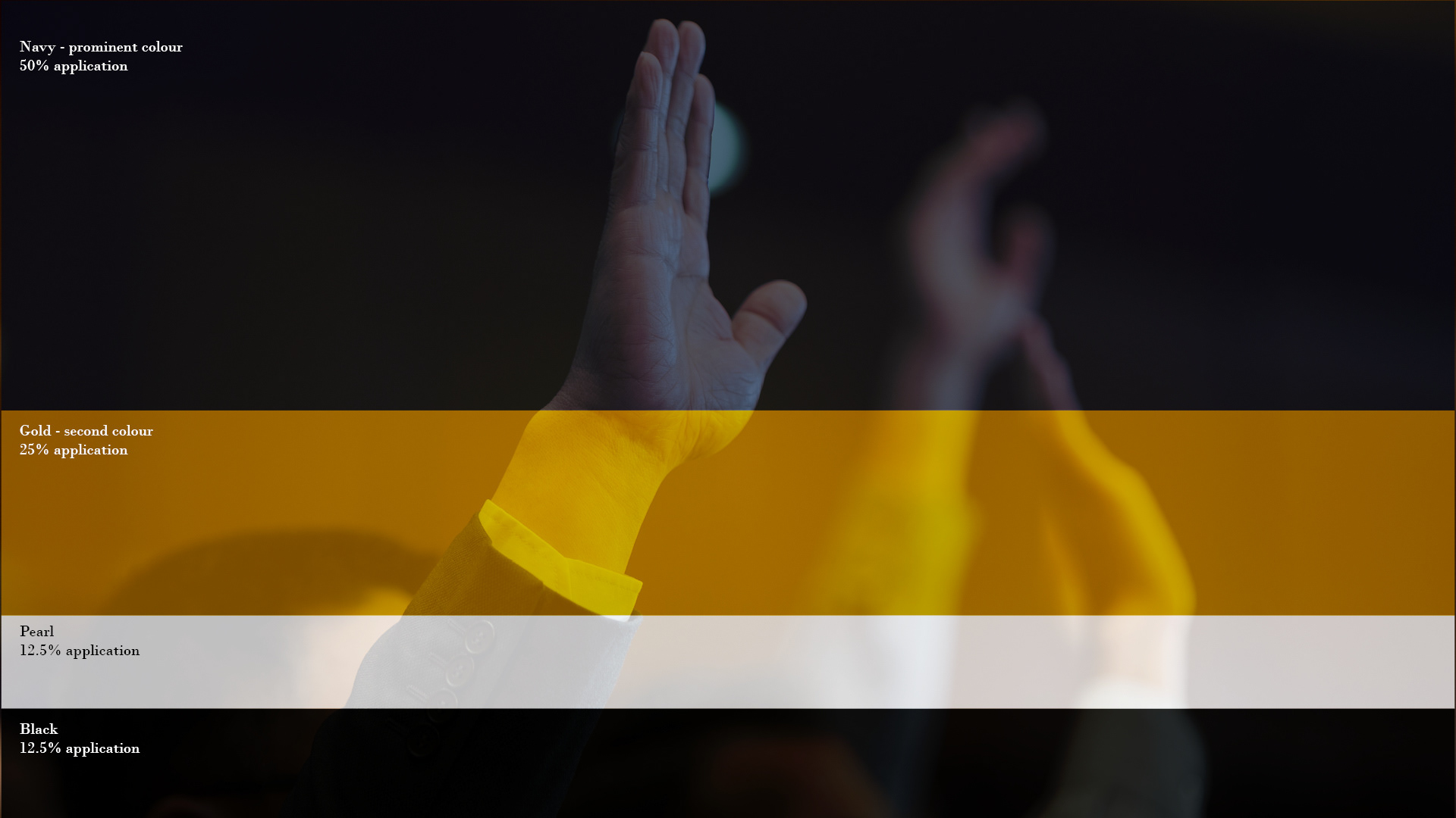
A deep navy base establishes stability, intelligence, and trust, while gold accents introduce a sense of value, prosperity, and discernment. The geometric mark reinforces ideas of structure, guidance, and strategic clarity, subtly reflecting the role Carepoint plays in navigating complex financial decisions.
Typography was selected for legibility, authority, and refinement - supporting the brand’s professional tone without unnecessary embellishment.
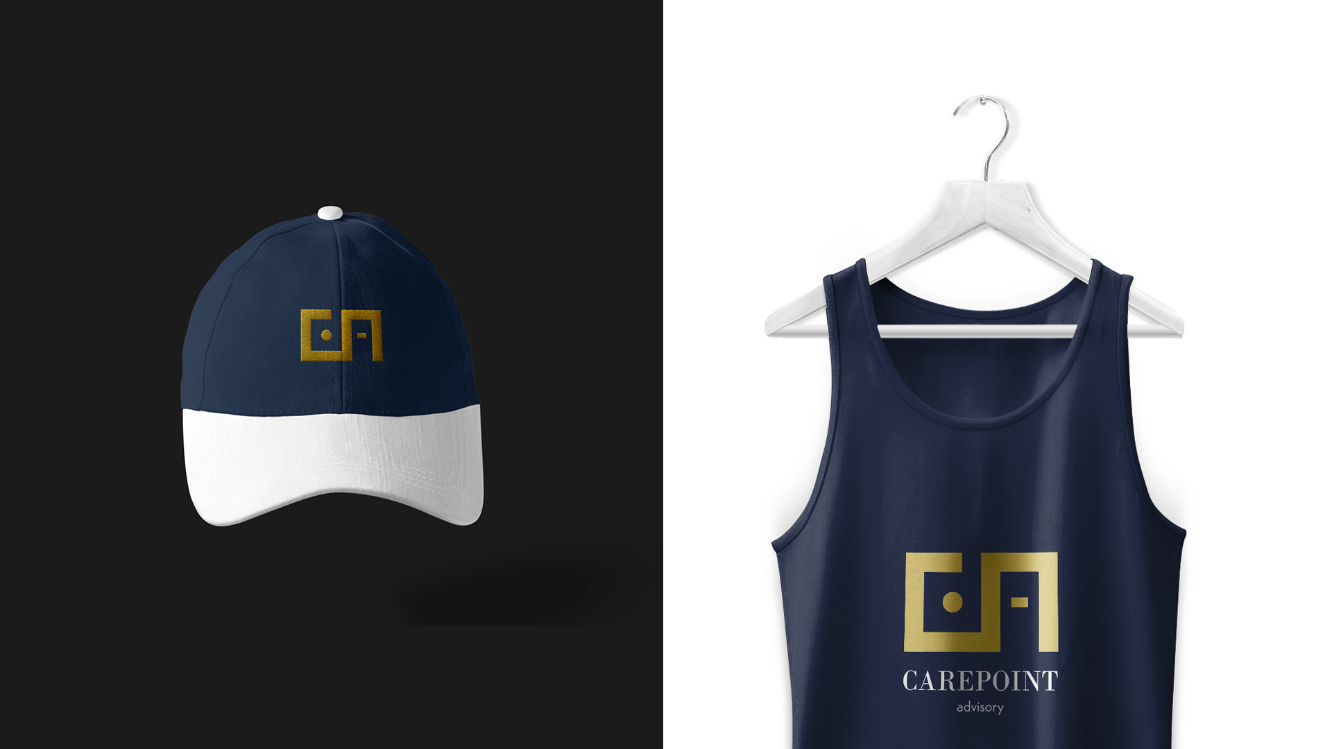
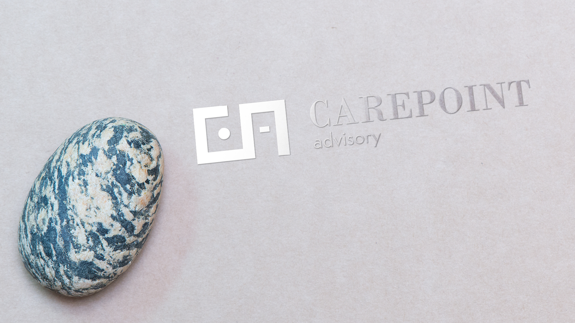
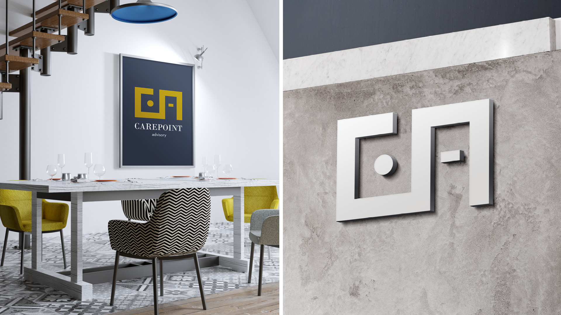
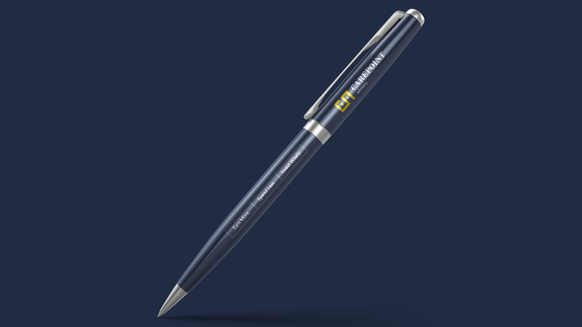
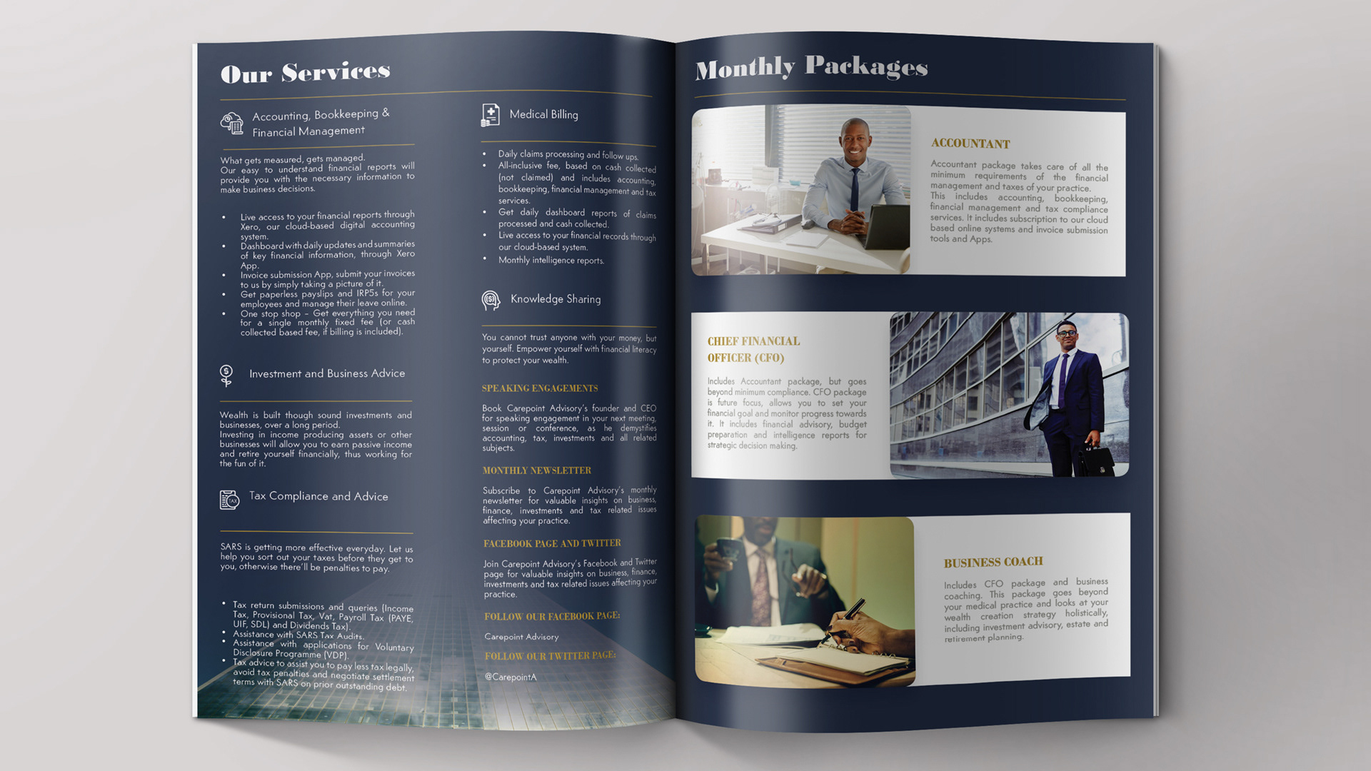
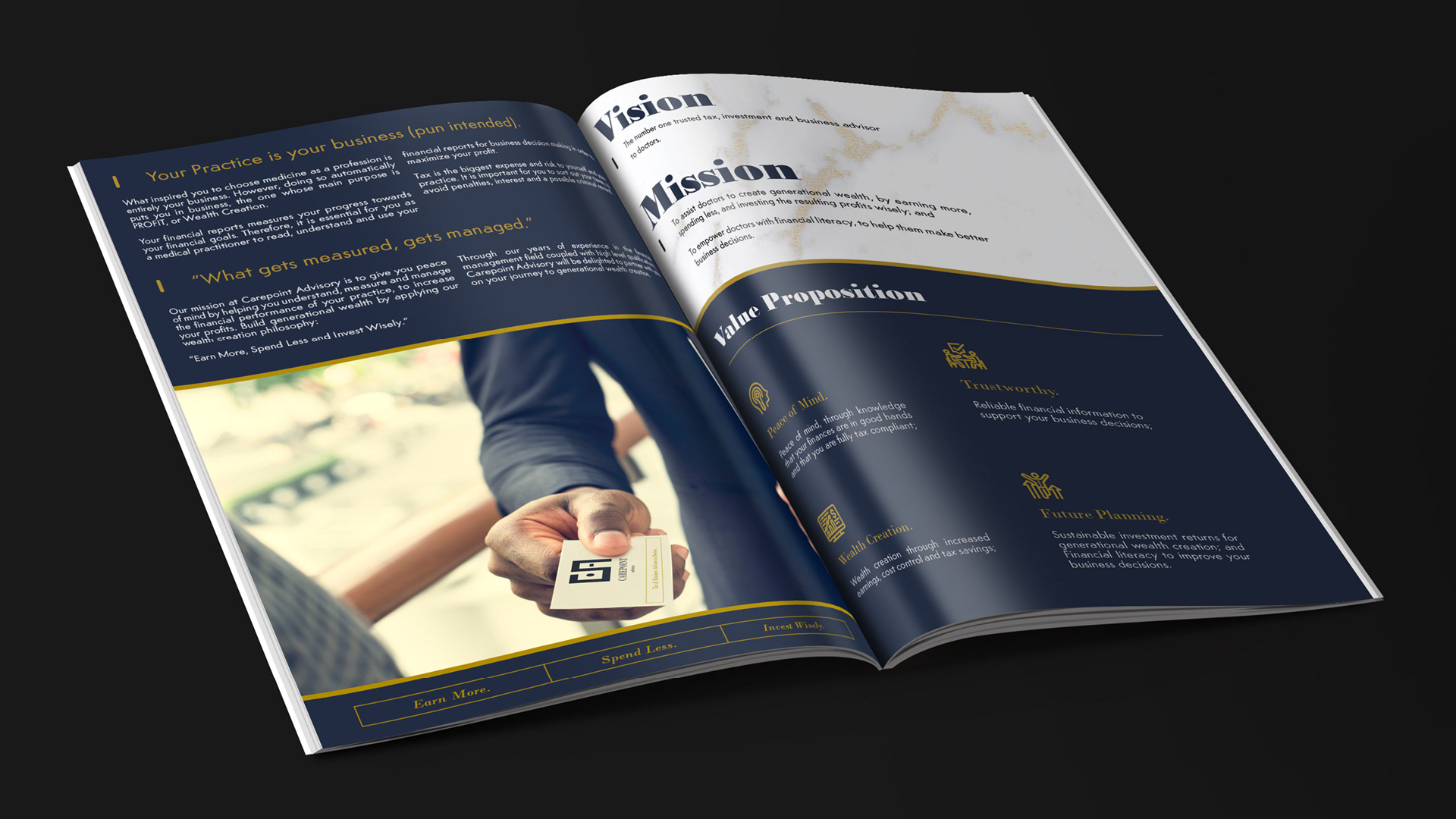
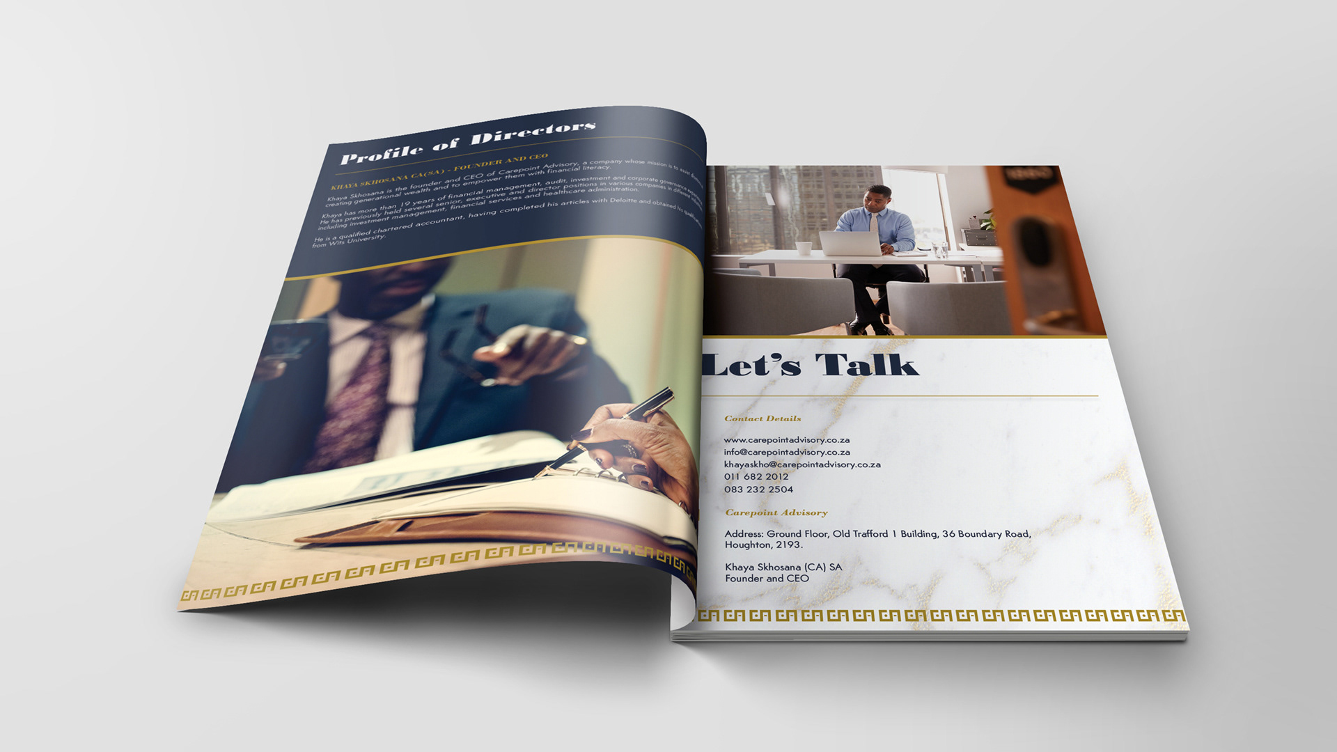
Brand System in Application
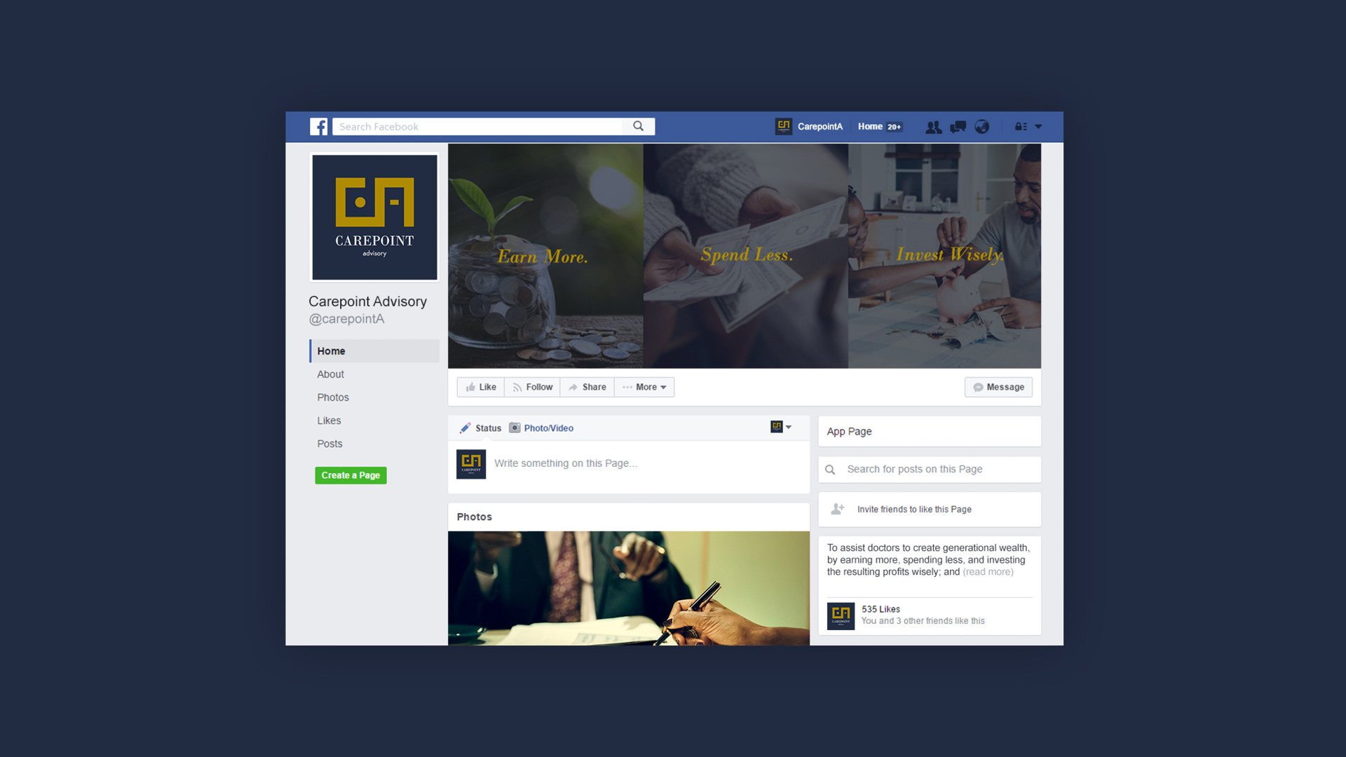
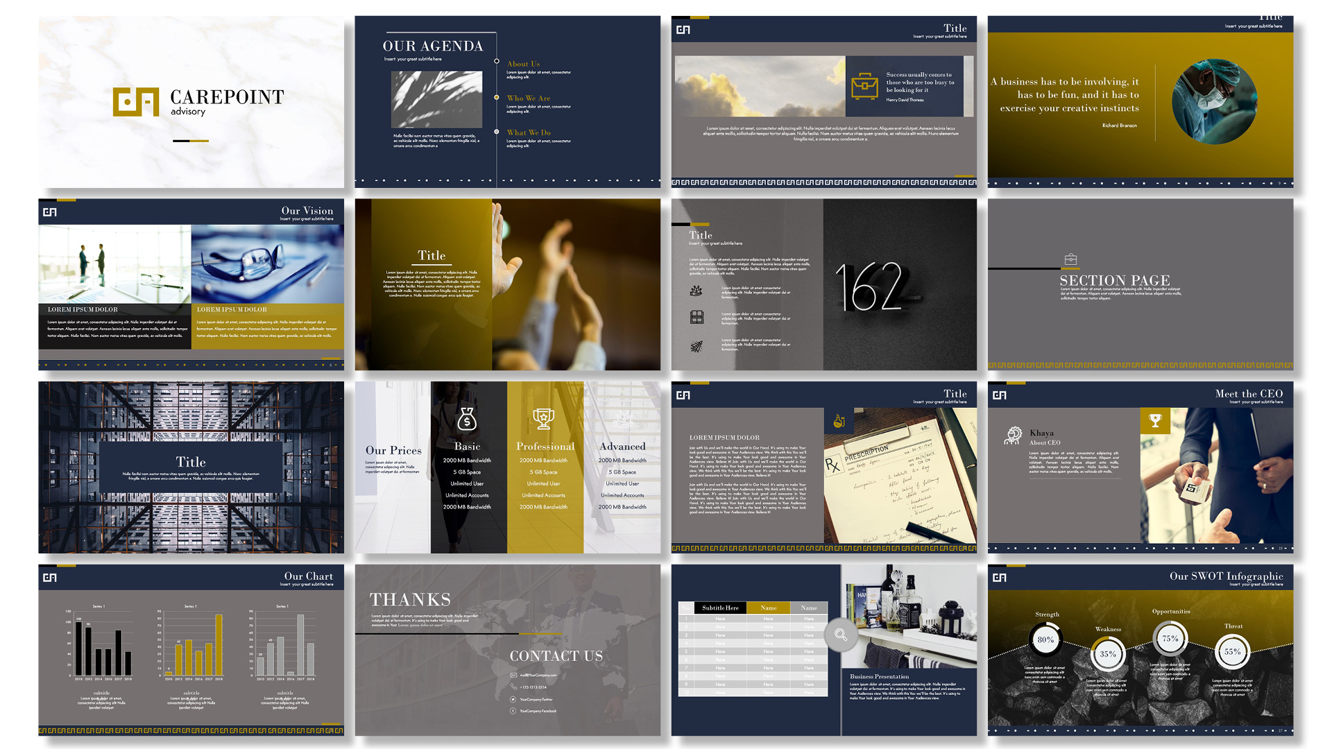
The Carepoint identity was designed as a cohesive system, not a single visual moment.
Across stationery, corporate documents, digital platforms, and environmental applications, the brand maintains a consistent presence - reinforcing recognition and trust at every touchpoint. Each element supports the same core message: clarity, control, and confidence in financial decision-making.


Brand Personality
The Carepoint brand was shaped around the following characteristics:
Composed
Trustworthy
Intelligent
Long-term oriented
The tone is calm and assured, reflecting an advisor who leads with insight rather than urgency.
Outcome
The final brand positioned Carepoint Advisory as a trusted, long-term financial partner for medical professionals. It reflects an organisation focused on sustainable wealth creation, sound governance, and informed decision-making - aligning the visual identity with the depth and seriousness of the service offering.
Why This Matters
This project reflects my approach to branding: starting with understanding people, context, and intention before translating strategy into form. The result is a brand built not for attention, but for endurance.